
The True Autumn Palette: How to Tell If You’re a True Autumn, And What It Actually Means
- Monica Thompson

- Apr 24
- 8 min read
A Guide to True Autumn in the 12-Season Colour System

In this article, you’ll discover everything you need to know about the True (Warm) Autumn colour season, including:
✔ The key characteristics of True Autumn, including typical hair, eyes, skin tone, and overall contrast
✔ A closer look at the True Autumn colour palette, including best colours and neutrals
✔ Practical tips on how to wear your colours well and where to focus your investment pieces
✔ True Autumn outfit strategies that help you look grounded, polished, and cohesive
✔ How sister palettes can expand your options while keeping your look harmonious
✔ Why a professional colour consultation is the most accurate way to confirm your season
If you want absolute clarity on your season — especially before investing in your wardrobe, makeup, or hair colour — a professional colour analysis removes the guesswork and shows you the difference in real time.

True (Warm) Autumn is one of the three Autumn seasons in the 12-season colour analysis system. Like all Autumn types, its defining characteristics are Warm, Deep, and Muted — with warmth being the dominant trait. This is the warmest palette of all the Autumn seasons.
True Autumn sits between Soft Autumn and Deep Autumn on the seasonal flow chart. It shares the softness and earthiness of Soft Autumn and the richness of Deep Autumn, but without extreme depth or heaviness.
Compared to Deep Autumn, True Autumn is lighter and less dramatic. Compared to Soft Autumn, it has greater richness and saturation.
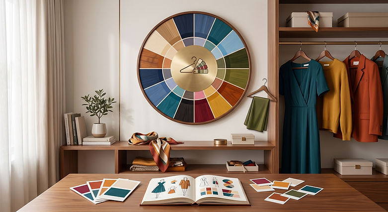
The True Autumn colour palette is earthy, grounded, and naturally warm — think autumn leaves, spiced browns, mossy greens, warm teals, and golden harvest tones. These colours feel rich and harmonious rather than bright or high-contrast.

How do I know if I am a True Autumn?
The key characteristics of True Autumn include typical hair, eyes, skin undertone, and overall contrast.

Before reviewing the characteristics below, it’s important to remember that colour analysis is about harmony, not perfection. You don’t need to match every trait to belong to a season — what matters most is how colour interacts with your natural features.
It’s also important to acknowledge that traditional colour analysis has historically focused on lighter skin tones. At Style Synergy Studio, we recognise that True Autumn colouring appears across all ethnicities. Softness and coolness can show up differently depending on your background — and that variation is completely valid.
If you feel unsure, sit between seasons, or want to avoid costly wardrobe or hair mistakes, a professional colour analysis is the most reliable way to determine your season.
Typical Characteristics of a True Autumn
True Autumn is defined by rich warmth, natural depth, and soft contrast. This season radiates grounded confidence, warmth, and approachability.
Overall Appearance
✔ Your overall look appears warm, earthy, and harmonious rather than bright or stark
✔ Your colouring looks golden, bronzed, or sun-warmed rather than cool or rosy
✔ Warm, rich colours are more flattering than icy, pastel, or overly bright tones

Hair
✔ Hair is typically medium to dark in depth — golden brown, chestnut, auburn, warm dark brown, or copper
✔ Undertones are clearly warm, such as golden, reddish, or caramel rather than ashy
✔ Hair often appears rich, dense, or softly glossy rather than light or reflective


💡 Need help choosing the right hair colour for your season?
For True Autumns, the right hair colour enhances warmth and richness, while the wrong shade can make features appear washed out or overly harsh. Our True Autumn Hair Colour Guide includes tailored shade recommendations, celebrity inspiration, salon-ready advice, and expert tips for transitioning to grey — so you can make confident, informed decisions.
Eyes
✔ Eyes appear warm, soft, and expressive rather than icy or intensely bright
✔ Common eye colours include warm brown, hazel, olive, green, or warm blue
✔ In deeper skin tones, warmth may show through amber flecks or gentle depth in the iris
✔ Eyes tend to have a soft richness rather than sharp contrast

Skin
✔ Skin can range from very light to deep, but always carries a warm undertone
✔ Undertones may appear golden, peachy, warm beige, or bronze
✔ Warm metals such as gold, bronze, brass, and copper are typically more flattering than silver
✔ Lips often have a naturally warm terracotta, peach, or muted coral tone

Contrast Level
✔ True Autumn has low to medium contrast — features blend rather than sharply contrast
✔ Your colouring feels cohesive and grounded rather than striking or dramatic
✔ Outfits look best when they reflect this softer contrast level
✔ High contrast (black and white, neon brights) can feel overpowering
✔ Understanding contrast helps guide colour combinations, prints, and makeup intensity

Remember, these traits are guidelines, not requirements. A professional colour consultation offers the most accurate result — especially before investing in clothing, hair colour, or makeup changes.
The True Autumn Colour Palette
The True Autumn colour palette is warm, earthy, and richly muted. These colours are infused with golden warmth and natural depth — think rust, terracotta, olive, moss, warm teal, mustard, and spiced browns.
As the warmest Autumn palette, True Autumn prioritises warmth first, followed by richness and softness. These colours are never icy, pastel, or overly bright. Instead, they feel grounded, comforting, and organic — like nature in early autumn.
✔ No cool, icy, or overly bright shades — warmth is essential
✔ Colours enhance natural richness and create a healthy, even complexion
✔ Even deeper colours remain warm and soft, never harsh or stark
✔ The palette includes earth tones, foliage greens, warm blues, and spiced neutrals

While True Autumn shines in rich colour, neutrals are essential for balance — and they must remain warm and earthy.
✔ Replace black and stark white with cream, warm taupe, camel, and rich brown
✔ Olive, warm navy, and soft teal are better choices than cool charcoal or grey
✔ Light neutrals like ivory and warm beige are most flattering near the face
✔ Chocolate brown and warm espresso add depth without overpowering
✔ Black is best avoided or softened with warm colours nearby
True Autumn colours feel grounded, natural, and timeless. When paired with the right neutrals, your wardrobe becomes cohesive, wearable, and effortlessly elegant.
Need Help Making the Most of Your True Autumn Palette?
Our True Autumn Digital Colour Wallet is designed to help you shop, style, and dress with confidence.

✔ 160+ expertly curated True Autumn colours
✔ Organised by colour family – neutrals, yellows, reds, pinks, greens, blues, and purples
✔ Includes 60 sister palette shades for extra flexibility across season.
✔ A clear list of colours to avoid so you know what to skip
✔ Styling tips to help you mix, match, and accessorise with ease
✔ Instant download – 21 beautifully designed PDF pages
✔ Phone-friendly format – perfect for in-store or online shopping
How to Wear Your Colours as a True Autumn and Essential Outfit Strategies
Dressing as a True Autumn is about embracing rich warmth, depth, and earthy clarity — never cool tones, ashy softness, or overly muted palettes. The goal is grounded richness: when your colours and styling are aligned, the overall effect is vibrant, warm, and naturally striking rather than dull or overly blended.
✔ Pair rich, warm colours with deep neutrals — Chocolate brown, olive green, warm navy, camel, and ivory create a strong, cohesive base that enhances your natural colouring without looking flat or washed out.
✔ Keep contrast moderate and naturally defined — True Autumn looks best with clear but harmonious combinations where colours are distinct yet still feel warm and balanced rather than stark or high-contrast.
✔ Avoid cool, icy, or overly muted shades near the face — These tones can dull your natural richness and disrupt harmony, especially in tops and accessories.
✔ Choose warm, earthy colour combinations — Rich, nature-inspired pairings (like rust with olive or mustard with deep teal) are more flattering than faded, dusty, or overly soft outfits.
✔ Use your best colours close to the face — Tops, scarves, makeup, and jewellery in your True Autumn palette enhance warmth and create a vibrant, healthy-looking complexion.
✔ Select rich textures and slightly structured fabrics — Leather, wool, corduroy, and textured knits reflect the palette’s depth and warmth while keeping your overall look cohesive and polished.

When your True Autumn colours are styled with intention, your skin looks brighter, your features appear softer, and your overall style feels cohesive and natural — often reducing the need for heavy makeup. This is the power of dressing in alignment with your seasonal colour palette.
True Autumn Sister Palettes – What Are They?
In the 12-season colour analysis system, sister palettes are the seasons that sit directly next to yours on the seasonal flow chart. In seasonal colour analysis, these neighbouring palettes share similar characteristics and colouring traits, making them closely related in the colour world. Understanding your sister palettes provides extra flexibility when shopping, styling outfits, or adapting hair colour and makeup choices — especially if you sit between seasons or want more variety while still staying harmonious with your natural features and True Autumn colour palette.
For True Autumn colour analysis, the two sister palettes are:
✔ Soft Autumn — True Autumn’s softer, more muted sister palette. It shares the same underlying warmth, but with less intensity, lower saturation, and a more blended, gentle appearance. Colours feel earthy and softened rather than rich and defined. You may relate to the Soft Autumn palette if your colouring is warm but slightly muted, and softer, more toned-down shades maintain harmony without overpowering your natural warmth.
✔ Deep Autumn — True Autumn’s deeper, more intense sister palette. It maintains the same warm undertone, but with added depth, contrast, and richness. Colours appear darker and more dramatic rather than balanced and clear. This palette may feel like a better fit if your colouring handles deeper, stronger shades well, and bold, autumnal tones enhance your features while still preserving warmth without looking too heavy.

Why Sister Palettes Matter
✔ They’re helpful if you find yourself drawn to colours just outside your core palette
✔ They offer extra options when shopping – especially in stores that don’t cater to your exact palette
✔ They can make makeup, hair colour, and outfit planning more flexible while keeping your overall look cohesive
✔ They help if you sit between seasons and you want to fine-tune your wardrobe
✔ They add variety while maintaining balance
Your True Autumn Digital Colour Wallet includes 60 sister palette shades, so you can easily expand your wardrobe options while staying in your harmony zone. These tones are handpicked to work with your natural colouring without throwing off your look.
True Autumn Is About Overall Harmony, Not Guesswork
You don’t need to match every description to be a True Autumn. What matters most is how True Autumn colours interact with your unique features — enhancing warmth, richness, and balance.
Online guides can point you in the right direction, but only a professional colour analysis can confirm your season with certainty. At Style Synergy Studio, consultations are personalised, inclusive, and based on real draping — not quizzes, filters, or stereotypes.
Written by a professional colour analyst with experience working across all skin tones, contrast levels, and personal style goals.

By Monica Thompson, Founder and Lead Consultant, Style Synergy Studio
About The Author
Monica Thompson, Founder of Style Synergy Studio

Monica Thompson is a certified image consultant and the founder of Style Synergy Studio. With over a decade of experience and professional training from Study in Style, she has guided 5000+ women in discovering the colours that enhance their natural beauty and confidence. Monica is passionate about making colour analysis inclusive, empowering, and easy to apply to everyday life—because confidence is always in style.


