
The Best Festive Colours for Every Colour Season
- Monica Thompson

- Dec 10, 2025
- 6 min read
A Complete Guide to Holiday Dressing for All 12 Colour Seasons

Festive dressing is an art — and the colours you choose play a powerful role in how bright, polished, and radiant you look. The holiday period introduces a timeless palette of metallics, reds, greens, and jewel tones, but not every version of these classic shades suits every complexion.
Colour Analysis makes festive styling effortless. Below is your complete, season-by-season guide to the exact festive colours that bring out your natural glow, whether you’re a sparkling Spring, a soft Summer, a rich Autumn, or an icy Winter.
Spring Palette
Warm | Bright | Clear
Springs shine in warm, lively, golden-toned festive colours. Think champagne bubbles, fresh berries, and sunshine reflecting on tinsel
Bright Spring
Bright Spring is radiant, playful, and vivid. Your colouring thrives on clarity and warmth, making you look incredible in lively festive hues that lift and brighten your features.
Your festive versions:
Gold: Bright warm gold enhances your natural glow and mirrors your inherent brightness.
Red: A bright warm red brings out the clarity in your undertone and adds cheerful vibrancy.
Green: Lime green and bright emerald echo your lively, high-energy palette.
Silver alternative: Warm platinum offers the metallic shine you need without cooling your warmth.
Also beautiful: warm fuchsia, coral, electric turquoise — all joyful, effervescent holiday tones.

True Spring
True Spring is warm, radiant, and fresh, with a palette that feels like sunshine and new beginnings. Your festive colours should feel warm, golden, and naturally uplifting.
Your festive versions:
Gold: Bright warm gold reinforces your golden glow and complements your warmth beautifully.
Red: Warm tomato red adds playfulness while staying harmonious with your undertone.
Green: Warm emerald is festive, rich, and perfectly aligned with your natural warmth.
Silver alternative: Warm platinum offers a subtle, soft metallic for moments when you want something lighter than gold.
Also try: marigold, peach, warm ivory — glowing tones that feel effortlessly celebratory.

Light Spring
Light Spring is delicate, airy, and fresh. You shine in pastel-leaning festive colours with a warm, luminous edge.
Your festive versions:
Gold: Champagne gold is perfect for you — light, warm, and softly sparkling.
Red: Soft warm red (a lighter version of tomato) brings gentle warmth without overpowering you.
Green: Warm mint and soft fresh greens echo your pastel-like radiance.
Silver alternative: Warm platinum keeps your look light and harmonious.
Also gorgeous: aqua, light coral, buttercream — dreamy, festive colours with an airy glow.

SUMMER PALETTE
Cool | Soft | Muted
Summers look their best in cool, blended, softly elegant festive colours. Think frosted berries, moonlit snow, and antique ornaments — understated but incredibly chic.
Light Summer
Light Summer is soft, airy, and cool. Your festive palette should feel delicate and refined, with gentle contrasts and a cool undertone.
Your festive versions:
Gold: Soft muted gold used sparingly adds warmth without overwhelming your coolness.
Silver: Soft brushed silver is your ideal metallic — elegant and understated.
Red: Soft cranberry gives you a festive touch with a refined, muted feel.
Green: Soft sage adds a peaceful, wintry softness to your holiday looks.
Also lovely: icy pink, lavender, pastel berry — ethereal, feminine touches perfect for the season.

True Summer
True Summer is elegant, cool, and romantic. Your festive colours should feel refined, slightly muted, and beautifully cool.
Your festive versions:
Silver: Soft brushed silver enhances your cool clarity without too much shine.
Red: Cool berry red is your perfect festive red — crisp, flattering, and harmonious.
Green: Soft blue-leaning greens like sage or misty mint complement your cool undertone.
Also elegant: cool navy, dusty plum, rose — timeless, wintry sophistication.

Soft Summer
Soft Summer is the most muted and blended of all the cool palettes. Your festive colours should feel velvety, subtle, and gently cool.
Your festive versions:
Gold: Soft muted gold complements your understated warmth beautifully.
Silver: Antique or brushed silver blends seamlessly into your soft palette.
Red: Soft cranberry gives a festive pop without being too bold.
Green: Sage and muted olive reflect your natural depth and softness.
Also harmonious: mink, muted teal, mauve — elegant, dusky tones for cosy winter styling.

Need More Colour Inspiration?
Our Digital Colour Palettes is your go-to styling tool with everything you need to shop, plan, and dress with confidence.

✔ 160+ expertly curated colours tailored to the Bright Spring season
✔ Divided into clear groups – neutrals, yellows, reds, pinks, greens, blues, and purples
✔ Includes 60 sister palette shades for extra flexibility across season.
✔ A list of colours to avoid so you know what to skip
✔ Styling tips to help you mix, match, and accessorise with ease
✔ Instant download – 21 beautifully designed PDF pages
✔ Phone-friendly format – perfect for in-store or online shopping
AUTUMN PALETTE
Warm | Rich | Earthy
Autumns shine in earthy, deep, luxurious festive colours reminiscent of candlelight, spiced mulled wine, and firelit rooms. Your holiday palette should feel rich, warm, and grounded.
Soft Autumn
Soft Autumn is warm-muted and quietly rich. Your festive colours should feel earthy, gentle, and softly glowing.
Your festive versions:
Gold: Soft muted gold warms you without overpowering your subtle colouring.
Silver: Antique silver gives you a cool metallic option that still holds warmth.
Red: Soft cranberry adds depth while staying soft and harmonious.
Green: Muted olive and sage capture your autumnal softness perfectly.
Also glowing: terracotta, warm taupe, soft rust — warm, tranquil festive tones.

True Autumn
True Autumn is golden, rich, and deeply warm. Your festive colours should feel earthy, opulent, and luxurious.
Your festive versions:
Gold: Bright warm gold amplifies your natural warmth and richness.
Red: Warm burgundy gives you sophistication and festive depth.
Green: Forest green is your iconic holiday colour — grounded, warm, and lush.
Silver alternative: Warm antique metals keep your palette cohesive and golden.
Also rich: burnt orange, spice tones — comforting, glowing holiday shades.

Deep Autumn
Deep Autumn is bold, intense, and dramatically warm. Your festive palette should reflect your natural depth and richness.
Your festive versions:
Gold: Antique gold and bronze harmonise beautifully with your depth.
Red: Wine and deep burgundy highlight your intensity and richness.
Green: Deep blue-green is festive, luxurious, and perfectly aligned with your palette.
Silver alternative: Darkened metallics provide a sophisticated cool contrast without feeling icy.
Also stunning: deep teal, espresso brown — sumptuous, impactful festive colours.

WINTERS
Cool | High-Contrast | Brilliant
Winters excel in high-contrast, icy, jewel-toned festive colours that feel crisp, modern, and glamorous — like snow crystals, gemstones, and frosty air.
Deep Winter
Deep Winter is dramatic, cool, and powerful. Your festive palette should be bold and striking.
Your festive versions:
Silver: Bright silver reinforces your clarity and high contrast.
Gold alternative: Stick to cool metallics to preserve your crisp undertone.
Red: Wine and burgundy are deeply flattering and festive.
Green: Deep jewel-toned blue-greens enhance your rich depth.
Also striking: black cherry, ink navy, emerald — sharp and sophisticated.

True Winter
True Winter is cool, vibrant, and brilliantly clear. Your festive palette should feel crisp and high-impact.
Your festive versions:
Silver: Bright icy silver enhances your clarity.
Red: Holly red is your quintessential festive shade — bold and icy.
Green: Icy teal and cool emerald emphasise your jewel-toned brilliance.
Also crisp: snow white, charcoal, bright fuchsia — striking contrasts that highlight your features.

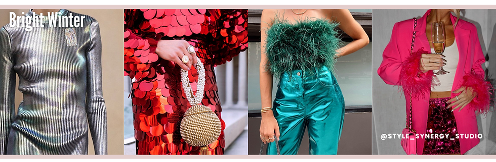
Bright Winter
Bright Winter is dazzling, energetic, and jewel-like. Your festive colours should be vibrant, electric, and full of clarity.
Your festive versions:
Silver: Mirror-bright silver complements your sparkling intensity.
Red: Holly red echoes your vibrant, cool clarity.
Green: Jewel emerald lights up your complexion and matches your high contrast.
Also dazzling: sapphire, ruby, icy pink — gemstone tones that truly elevate your festive looks.
No matter your season, there is a festive palette that will make you look radiant, confident, and completely at ease. The key is choosing the right version of classic holiday colours — the gold that matches your undertone, the right red for your depth, the perfect green for your contrast. When your palette aligns with your natural colouring, everything from your complexion to your energy feels instantly more harmonious.
If you’re unsure of your colour season — or you’d simply like to feel more confident, polished, and intentional in the way you present yourself during the holidays — now is the perfect time to book a Colour Analysis session. Together, we’ll identify your exact season, explore the tones that make you glow, and curate a festive palette (and wardrobe) that feels beautifully authentic to you.
By Monica Thompson, Founder and Lead Consultant, Style Synergy Studio
About The Author
Monica Thompson, Founder of Style Synergy Studio

Monica Thompson is a certified image consultant and the founder of Style Synergy Studio. With over a decade of experience and professional training from Study in Style, she has guided 1000+ women in discovering the colours that enhance their natural beauty and confidence. Monica is passionate about making colour analysis inclusive, empowering, and easy to apply to everyday life—because confidence is always in style.


